Patient PortalYou’ve Been Logged Out
When you give hundreds of thousands of patients an easy way to pay bills, review treatment plans, and schedule appointments they tend to do those things. When the platform is hard to navigate and just generally unintuitive, the opposite happens. The redesign of this patient portal had one goal in mind: increase online payments. It achieved that and more.
Simple Functionality
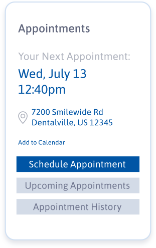
We set out to build an easy-to-navigate, supremely functional platform. The design would be beautiful, but in a “mathematical” kind of way.
Ok, the site is done. Time to get the word out.
The relaunch of the patient portal involved social media, email marketing, in-practice materials, and home page notifications for each of the eight brands that used the white-labeled platform.
BROWSE MORE WORK


