Kid's DentistreeGood monkey. Bad monkey!
Kid’s Dentistree, a dental brand caring for (you guessed it) kids, was in desperate need of an evolution. Its brand concept was as flat as the monkey head in its logo. And a discrepancy with that monkey was exactly what sparked the evolution.
Logo Evolution
After market research and focus groups revealed that the brand has a high degree of recognition and market share, we decided to stick loosely to the original concept.
But changes needed to be made. Drop the monkey, kill the gradients, expand the palette and for god’s sake, give that type some room to breathe!
The brand name didn’t exactly make sense.
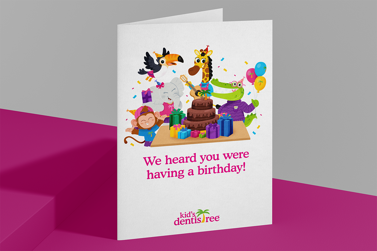
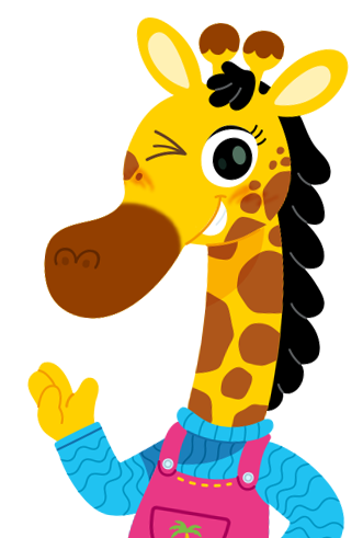
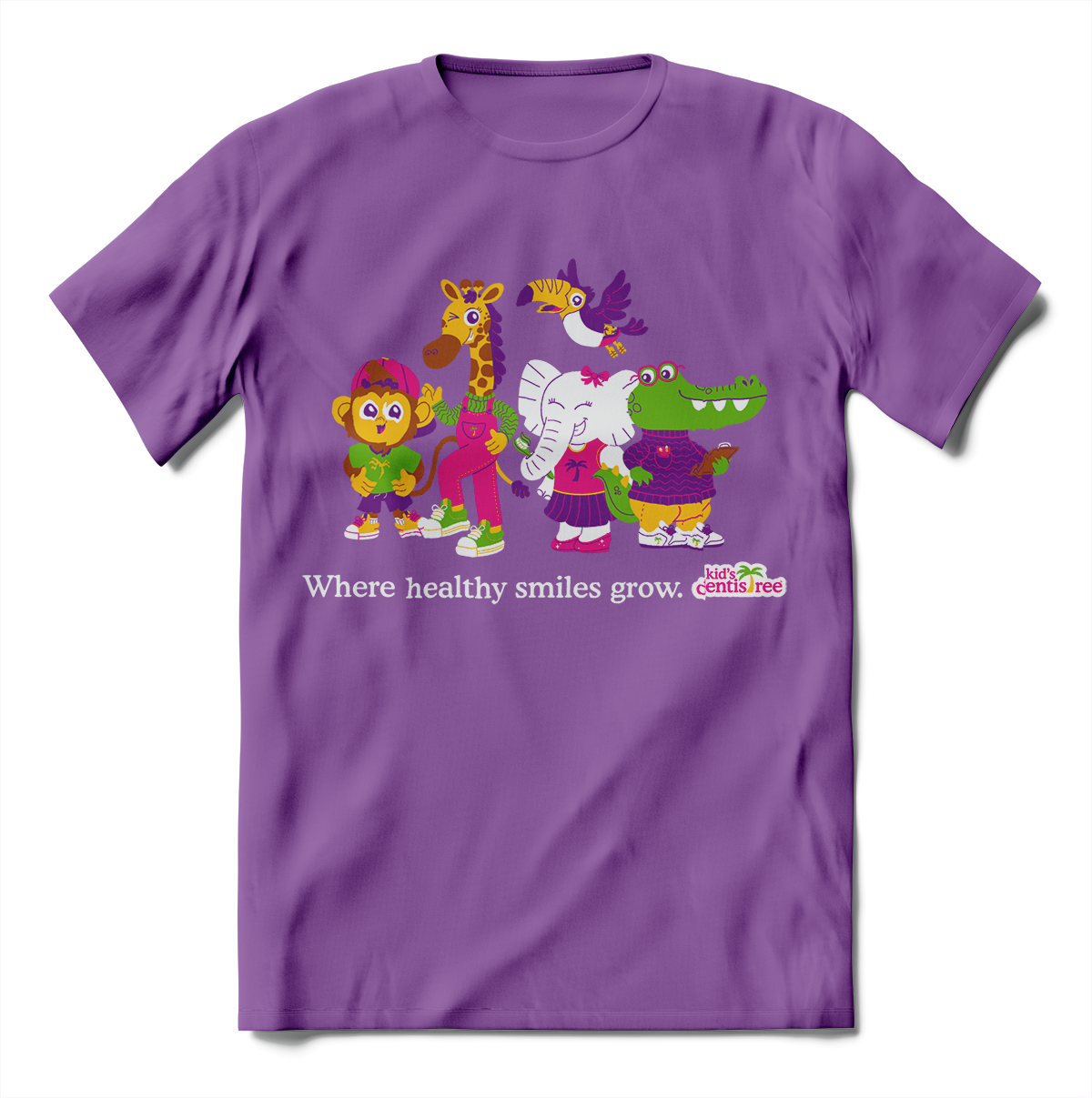
So we took the jungle theme that was only meant to justify the typo and built a brand experience. We developed characters, gave them personalities and prepared them to speak for the brand, directly to patients.
Would a kid rather learn how to floss from a dentist or a giraffe?
They lovingly became known as “The KDcrew.” These characters were illustrated in various themes like Halloween, Sports, and my personal favorite, Safari. That last one came in handy when we partnered with The Louisville Zoo for educational events for kids!
The Launch Campaign
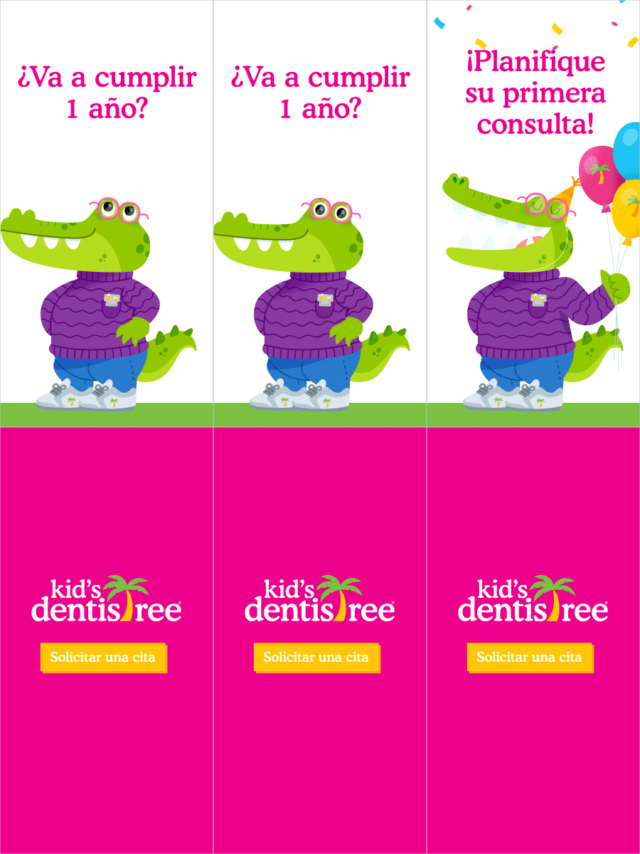
From billboards to educate the parents to eye-catching digital ads, this campaign had it all.
In-practice graphics, radio and tv ads, OTT, social media, a new landing page, the list goes on.
BROWSE MORE WORK


